The evolution of advertising
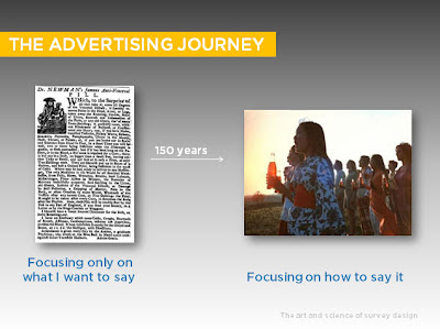
Once upon a time advertising look like this...
But unfortunately not many people were reading them. So they began to evolve. They first of all started to realise the value of adding images...
And slowly over the course of 100 years or so they learnt the art of creative communication...
Minimalising the use of text and focusing on branding and selling messages and visuals grabbed peoples attention and re-enforced the message.
Leading eventually to the evolution of the advertising agency...
Companies realise realising that they did not quite have the skills to do this job themselves, they passed it on to people who specialised in it.And who today would deny the importance of creativity in advertising design.
Over a period of 200 years advertising moved from focusing only on what people wanted to say to focusing on how to say it.
Presentation design
They then tried rather unsuccessfully to liven them up with clipart and whacky transition effects..
And by throwing everything they could think of onto the page to grab your attention....
But slowly they learnt that colour and images should not be used just to decorate per say, but to help communicate ideas more clearly...
Image courtesy of Presentation Zen
And they learnt to cut back on content and use well chosen visuals to help emphasise content and make it more memorable...
And many of us now would probably call in a designer to help us create an important presentations say if we were delivering to 50 people at a conference..
Over the course of 20 years we have moved from focusing only on what we wanted to say to focussing on how to communicate a message.
And so to survey design...
Once upon a time surveys used to look like this..
And they now tend look like this...
Sorry I am being a bit unfair there as there are people creating surveys that do look better than this, and so this is probably a bit of a cheep trick, but I hope you get my point that this is still today what the majority of surveys look like. We have not really got our heads round the survey design process quite yet. I would say we are still at the 1980's clip art and whacky transitions stage of things. Our idea of making a survey more creative is to add in often a badly designed flash question or slapping a thumbs up icon on the top of a likert scale. Our only real concession to the consumer in 15 year has been to add a progress bar, but I have seen recently suggestions we should take it off as it is causing drop-out (presumably because they are looking at it and thinking oh dear how much more of this survey have I got to endure!)
There is almost no basic grasp of design aesthetics in most surveys I see, very little effective use of imagery and that is just the start. The problems extend far beyond the visual. Our whole approach to the structure and copy writing of surveys is stuck in the 1950's when face to face interviews were pioneered, with these long verbose questions that nobody want to read and no sense of what it feels like as a respondent to answer a typical survey.
A question then is why?
Well there are clearly lots of reasons but the one thing in my mind is that we have not officially recognised as an industry survey design as a creative skill and we are not sure who's job it is either. And it is a task that is falling between 2 stalls...
Right now the only time creativity is considered is when the survey has been signed off and passed onto the survey programmer which I my mind is too late. And just the term survey "programmer" itself says something, often this is someone in a "downstairs" department so to speak who you are not really actually expecting any creativity from.
I feel that creativity needs to be injected right up the line starting at the conception stage and really needs to be focused at the writing stage, how we copy write and conceive questions and structure surveys is so important which is something I will be discussing in a later post.
My main point though is that we need to recognise the importance of creativity in research design and establish creative service teams in research companies that take charge of injecting more creativity in research design across the board, who have the authority to orchestrate things higher up the line than at the production stage. Akin to the authority an advertising agency has over the design of advertising.
Note: This topic and these slides are an extract from a presentation I recently delivered at the WARC 2012 conference on the future of Online research where I was talking about how to inject more creativity in survey design. The full deck and the full story can accessed from
www.warc.com/OnlineResearch2012Follow the discussion of this event from twitter on #nowandnext


EmoticonEmoticon